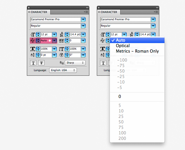
LEADING AND KERNING.
- Leading and kerning an important detail in Adobe Illustrator in design type of text. We can highlight two letters and adjust the kerning between them via the kerning (or tracking) drop-down within the Character Palette.

.gif)


LEADING.
- The vertical space between lines of type is called leading (rhymes with sledding). Leading is measured from the baseline of one line of text to the baseline of the line above it. Baseline is the invisible line on which most letters sit.
The default auto-leading option sets the leading at 120% of the typeface size (for example, 12‑point leading for 10‑point type). When auto-leading is in use, the leading value appears in parentheses in the Leading menu of the Character panel. You can change this default auto-leading by choosing Justification from the Paragraph panel menu and specifying a percentage from 0 to 500.
By default, leading is a character attribute, which means that you can apply more than one leading value within the same paragraph. The largest leading value in a line of type determines the leading for that line.For example :-
.gif)
We can see the word 'text' 12 pt Myriad and the leading is set as 14.5.To adjust use the up and down arrows on the leading control to make the space greater or move the text closer together.
This is the same text but the leading was changed to 21 pt. to move the text lines farther apart.
KERNING.
- Kerning is the amount of space between each individual character that you type. Sometimes the space between two characters is larger than others, which makes the word look uneven. You can use the Character panel to change the kerning setting for selected characters. You can expand or condense character spacing to create a special effect for a title, or realign the position of characters to the bottom edge of the text—this is helpful for positioning copyright or trademark symbols.

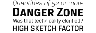
SERIF AND SAN SERIF
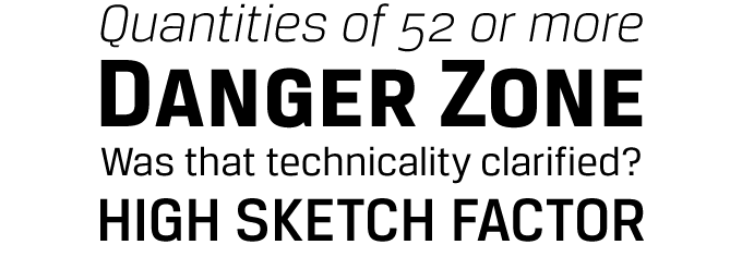
SERIF.
- Serifed fonts are widely used for body text because they are considered easier to read than sans-serif fonts in print.However, scientific study on this topic has been inconclusive. Colin Wheildon, who conducted scientific studies in 1982–1990, found that sans serif fonts created various difficulties for readers that impaired comprehension. According to Kathleen Tinkel, studies suggest that "most sans serif typefaces may be slightly less legible than most serif faces, but ... the difference can be offset by careful setting".Other studies have found no significant difference in readability for serif or sans serif.
For more information go to this link :- http://en.wikipedia.org/wiki/Serif
This is example of serif font


After I have do some research i have do some sketching for the movie poster design.


This is my research.


In this task i have to do a magazine cover page.So I have decide to make a magazine game cover page.This is some of my research


This is the picture of the popuar serif fonts.
SANS SERIF.
- The term comes from the French word sans, meaning "without". Sans-serif fonts tend to have less line width variation than serif fonts.Sans-serif fonts have become the most prevalent for display of text on computer screens. This is partly because interlaced screens have shown twittering on the fine details of the horizontal serifs. Additionally, on lower-resolution digital displays, fine details like serifs may disappear or appear too large. Before the term “sans-serif” became common in English typography, a number of other terms had been used. One of these outmoded terms for sans serif was gothic, which is still used in East Asian typography and sometimes seen in font names like Century Gothic or Trade Gothic.
For more information go to this link :- https://en.wikipedia.org/wiki/Sans-serif
This is example of san serif font


This is the picture of the list popular of sans serif fonts.
Anatomy Typography.

Antiqua, Antikva
The common German and Scandinavian names for serif faces, as opposed to "Grotesk" which means sans serif.The common German and Scandinavian names for serif faces, as opposed to "Grotesk" which means sans serif.
Ascender
Any part in a lowercase letter that extends above the x-height, found for example in b, d, f, h, k, etc. Some types of ascenders have specific names.
Cap height
The height from the baseline to the top of the uppercase letters (not including diacritics).
Descender
Any part in a lowercase letter that extends below the baseline, found for example in g, j, p, q, y, etc. Some types of descenders have specific names.
Ligatures
Special characters that are actually two letters combined into one. In cases where two adjacent characters would normally bump into each other, a ligature allows the letters to flow together more gracefully. This usually makes word shapes more aesthetically pleasing. Some common ligatures are "fi", "fl", "ff", "ffl", etc.
When ligatures are built-in as OpenType features, certain (older) operating systems and applications will not be able to access them.
TASK-Hotel Logo
In this task,for subject Typography Skill i have to design a hotel logo. The name of the hotel is 'VOUX HOTEL'. My sketches is shown below..:


After I sketch i choose the 2nd logo and develope more.


After i develope i have choose the final logo.If u can see i have write 'final' word at my logo.That I have choose for the final logo.After that put the final one into graph paper.

After I put in graph paper,I snap a picture then trace the logo using adobe Illustrator.I make 2 picture in digital.


This is logo that i have tracing in Illustrator.First I make just the outline and the second is i fill the in the black of the shape at certain partso look like the have been ben like origami.

This logo i have touch up their line make more thick.
TASK : Quotes.
For this task I must choose any quotes and design the font and the pattern on the quotes.I have do some research at Behance and Pinterest about the quotes design.


Sketching.


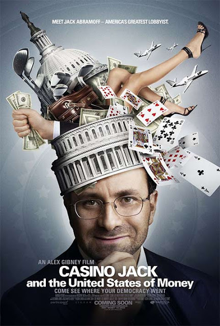
TASK 4 : Poster Movie.
In this task I do poster movie by applying typo in the poster.I have do some research about several movie.
I have look at Pinterest an other website for movie poster design.
This is several picture of poster movie design that i have research.

Movie : CASINO JACK and the United States of Money.
Directed by Alex Gibney.

Movie : Sweeny Todd
Directed by Tim Burton.


This is several of the poster movie of Iron Man.

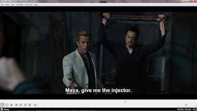


This is several screen shot of movie scene of the iron man movie.I take this from iron man 3.

Movie : Percy Jackson The Lightning Thief.
Directed by Chris Columbus.

Movie : Avatar
Directed By James Cameron.

Movie : The Avengers
Directed by Joss Whedon.
That some research i have do and for movie poster that i have choose is Iron man.
There is research for Iron man movie.


This is several of the poster movie of Iron Man.


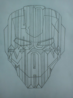
This is several sketch of my movie poster design.

This is my final sketc.Then i transfer it into Adobe Illustrator.
Tracing in Adobe Illustrator.


I have tracing the typo and the outline.


This is part of deatiling that i have do.


This i have complete the movie poster.I have apply metal texture on the ironman mask and also the typo so,they look like metal.

This is final look.
Task 5.
Typo and Picture.
This is some of my research.

Picture 1

Picture 2

Picture 3
Picture 4
Progress.
I have choose the picture and the text is born with freestyle.
I have choose the picture and the text is born with freestyle.

Picture 1
This is the picture.

Picture 2
I start with word 'born' and 'with'.I have do masking.

Picture 3
I have do a word 'freestyle'.

Picture 4
At the word born at masking,i have do some shadow and make like the women is front of the text.

Picture 5
Also i do shadow at letter Freestyle.

Picture 6
Touch up a little.

Picture 7
Final look.
Task 5.
Typography and Shape.This is my research.


Progress.
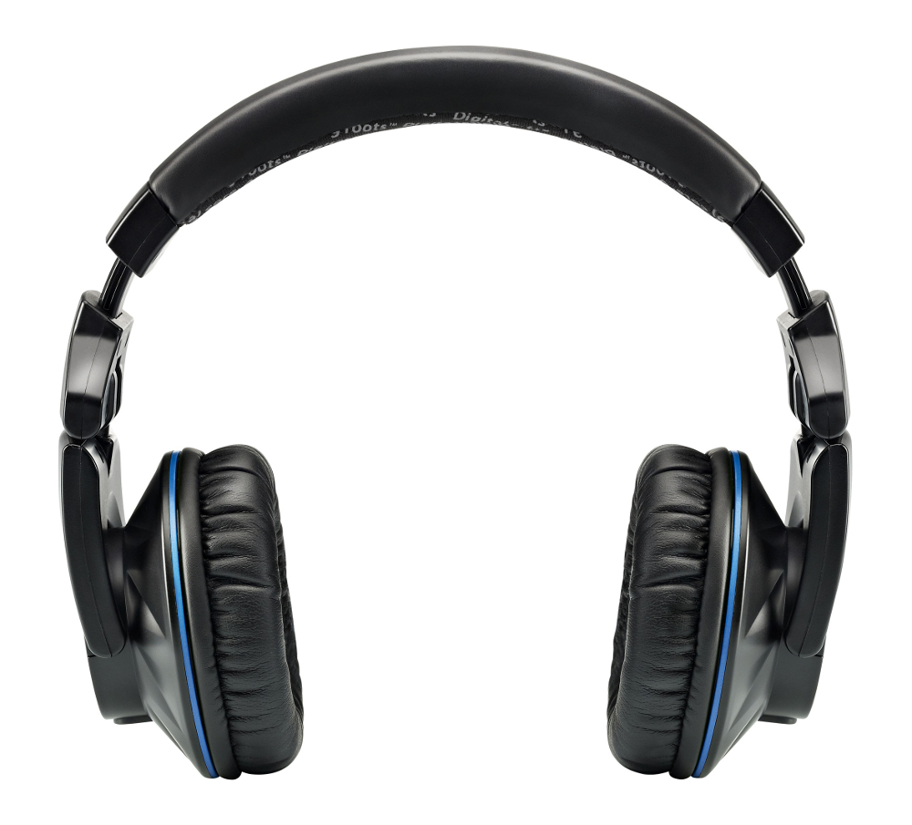
1.I take picture of headphone.
I make the task in Adobe Photoshop.

Picture 1

Picture 2
I have done do the word at earphone.I use word the related to music.

Picture 3
I rease the span of the earphone both side and at the top of the head of the span.

Picture 4
I make a backgraound of the picture.
Source picture background:http://pimpmychannel.com/backgrounds/bassintheplace.jpg

Picture 5
I make some coloring at the font make differemt then i add some background and the picture of on/off
Source picture:http://www.issiperu.com/imagenes/92481230/Los-mejores-Wallpepers-Minimalistas.html
Final Outcome.

Task 6.
Magazine Cover.In this task i have to do a magazine cover page.So I have decide to make a magazine game cover page.This is some of my research

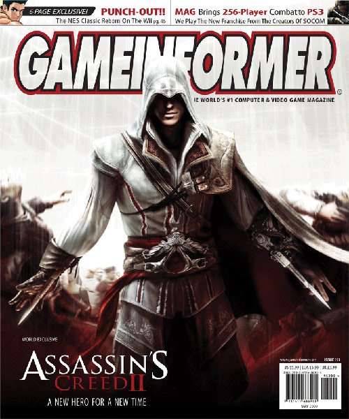
Picture 1.
Source:http://www.gamesetwatch.com/ptom-0902.jpg

Picture 2.
Source:http://fc02.deviantart.net/fs71/i/2011/314/1/0/game_core_magazine_cover_by_oliver240693-d4fpb12.png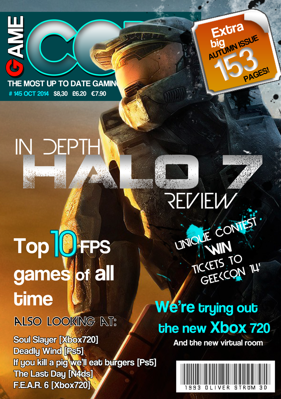

Picture 3.
Picture 4.
Source:http://hellgateguru.com/wp-content/uploads/2007/04/coverzo3.jpg

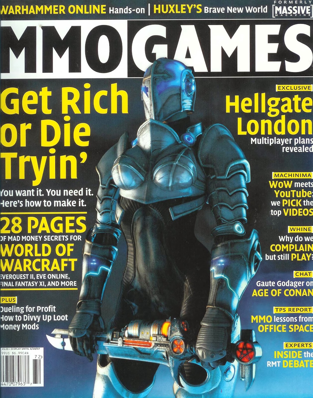
Picture 5.
Source:http://www.gamesetwatch.com/ptom-0803.jpg
Progress.
I have the magazine cove use Adobe Illustrator and Adobe Photoshop.

Picture 1
I take the picture first follow the size of magazine.
Picture 2
After that i save in PDF then transfer to Adobe Photoshop.

Picture 3.
I have start make the title of the book.The name of the magazine is 'Travelz' because travelz mean we can explore the world of game by this magazine.I also put the bar code at the bottom right of the magazine.

Picture 4.
I do the text and some glowing and put centre of the magazine.

Picture 5.
I put text 'Begin Ur Journey With War' mean that begin the game with war.I also have put the issues and the month and year of the magazine.

Picture 6.
I have put game Dota 2.I use font harry potter font style and make effect overlay.

Picture 7.
There the issues of Dota 2 and the logo of Dota 2.The word 'Begin Ur Journey With War' i have change the color and make stroke so look more nice.

Picture 8.
I have make another issues about the official review of the latest game.

Picture 9.
The issues of the latest game and i pick the green colour of the text.
Picture 10.
The third issues about the PS3 will will decrease because PS4will coming soon.I also put the page so they know what to see the issues.

Picture 11.
I have make a box and make some issues and have the page also.

Picture 12
I change the colour of the font from whte to green and add texture behind the font..for the sword i have do masking and look like the sword is in front of the title.

Picture 13.
I touch up a little.
Picture 14.
Final Outcome.